Digital Asset Trading Platform
Building the 'Bloomberg Terminal' for digital assets, a high-performance, modular trading terminal for professional traders, analysts, and funds.
Client
Mintify
Role
Sr. Product Designer
Scope
Product Strategy, UX Design, Design System, Data Visualization
Year
2024
Duration
3 months
The NFT market was fragmented: traders bounced between a half-dozen tabs, marketplaces for buying, Twitter for alpha, separate analytics tools for data. Most platforms were built for retail collectors, not pro traders who need real-time execution, deep liquidity across 69+ chains, and high-density data. I led the redesign to transform Mintify into the unified, professional-grade interface this market needed.
01. The Challenge
How might we build a unified, professional-grade interface that handles terabytes of real-time on-chain data without overwhelming the user or sacrificing performance? The previous version leaned maximalist, a cyberpunk aesthetic that looked striking in screenshots but confused newcomers and frustrated power users during 12-hour trading sessions.
69+
Supported blockchains
400k+
Active users
<100ms
Target interaction latency
Process & Methodology
This redesign followed a research-driven, iterative process grounded in professional trading realities. Discovery began with ethnographic research: I spent time observing traders on actual trading floors and conducted in-depth interviews with 12 power users to understand their workflows, pain points, and mental models. Competitive analysis covered Bloomberg Terminal, Tradingview, and emerging DeFi platforms. Insights were synthesized into user personas and journey maps using FigJam. The design phase employed a dual-track approach: rapid wireframing in Figma to validate information architecture, followed by high-fidelity prototypes using a component-first methodology. I built a comprehensive design system with 200+ components, leveraging Auto Layout, component variants, and design tokens exported via Tokens Studio for engineering handoff. Usability testing was conducted in two-week sprints using Maze for quantitative metrics and moderated sessions via Zoom for qualitative insights. Accessibility audits ensured WCAG 2.1 AA compliance. Engineering collaboration happened through daily standups, with designs documented in Notion and implemented using a Storybook-driven component library. Performance was validated through lighthouse audits and real-user monitoring to hit the sub-100ms interaction target.
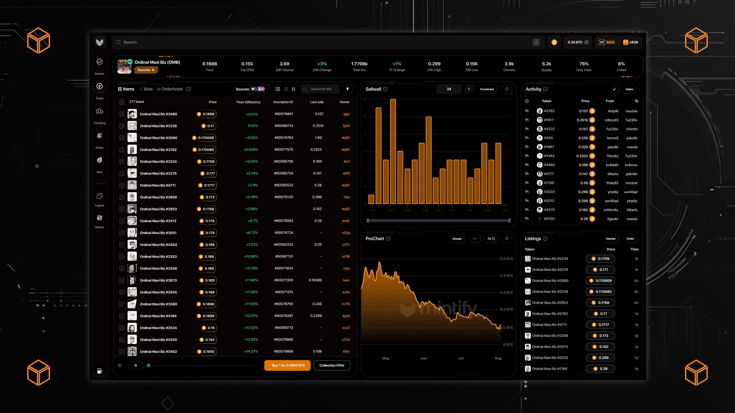
02. Modular Flexibility
I designed a customizable workspace where traders can drag, drop, and resize modules, heatmaps, momentum trackers, order books, portfolio views, to fit their specific workflow. No two traders work the same way; the interface had to adapt to the user, not the other way around. Each module is independently scrollable, collapsible, and remembers its state across sessions.

03. The 'Invisible' UI
For high-frequency trading, the interface must get out of the way. I implemented a high-contrast, dark-mode-first aesthetic with strict typographic scales to ensure readability during marathon sessions. Every pixel earns its place through direct task relevance, no decorative chrome.
Latency-first design: recognizing that 100ms can cost a trader an entry, I worked with engineering to ensure UI updates never block data streams. Color-coded micro-interactions signal market shifts instantly. Green pulse for buys hitting the book, red for sells, amber for your own orders filling.

04. Omni-Chain Aggregation
Mintify isn't just a window to one chain — it's a unified layer for Ethereum, Polygon, Base, Solana, Bitcoin, and 60+ more. The UX challenge: normalizing different metadata standards, gas models, and transaction speeds into a single, cohesive 'Buy' button experience. The solution was a standardized transaction drawer that provides clear feedback on gas estimates and bridge status across chains, abstracting complexity without hiding it from users who want the details.

This is the first trading interface that actually feels like it was built for how I work — not how someone imagined I might work.
— Professional NFT trader, beta tester
05. Design Evolution
The Mintify platform went through several major design iterations. Each version taught us something about what professional traders actually need versus what looks impressive in a pitch deck.
V1: The Cyberpunk Era
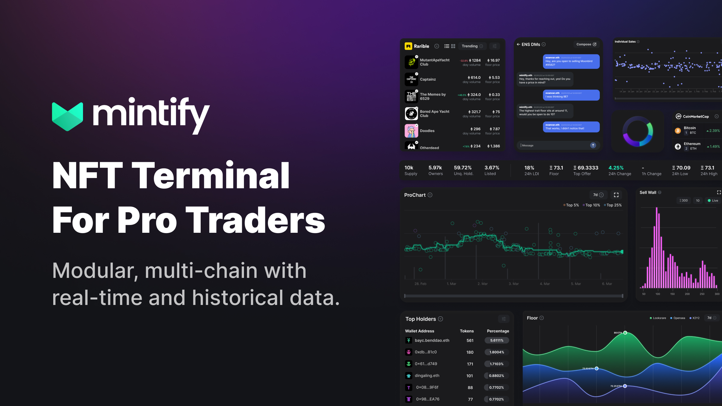
The original version leaned into a bold cyberpunk aesthetic — neon accents, sci-fi frames, aggressive typography. It photographed beautifully and generated buzz on crypto Twitter. But during extended trading sessions, the visual noise created fatigue. The decorative elements competed with the data for attention.
V1 Designs
The original cyberpunk dashboard — striking but visually demanding during long sessions
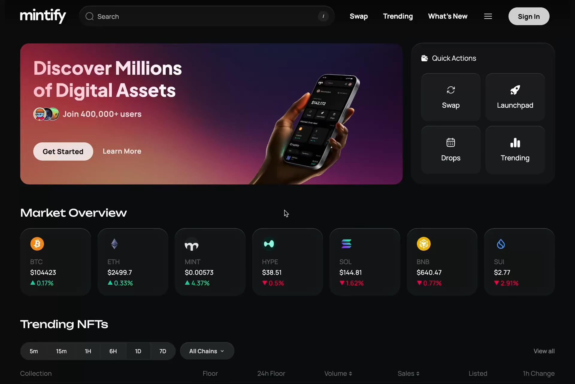
V2: ProDash Refinement
The second major iteration pulled back on the visual maximalism while preserving the power-user density. We moved to a more refined dark theme with softer gradients, cleaner data tables, and a modular layout system. This version became more accessible to new users while retaining the depth that pro traders demanded.
V2 ProDash Designs
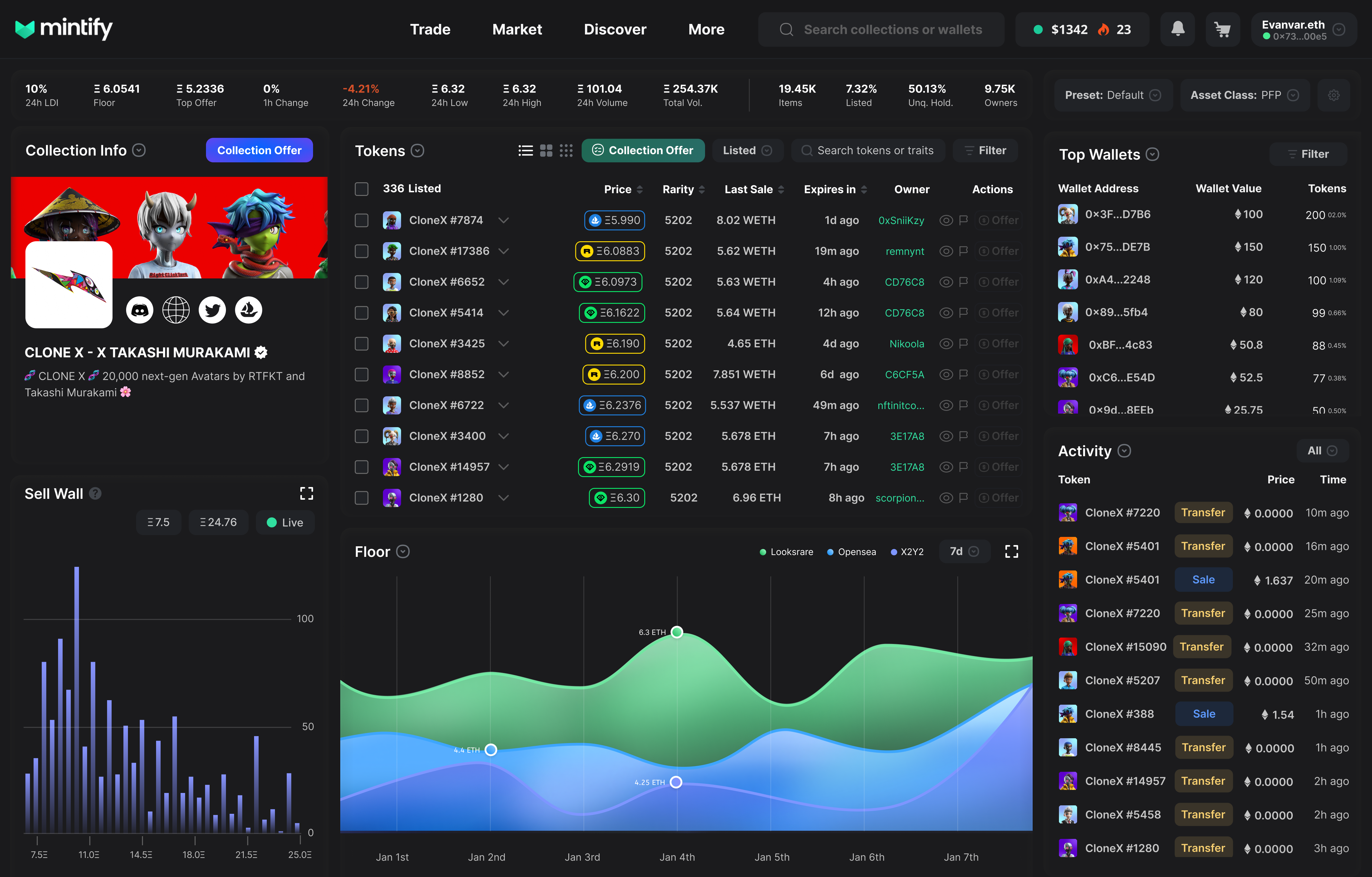
ProDash default layout — cleaner hierarchy, softer gradients, professional density
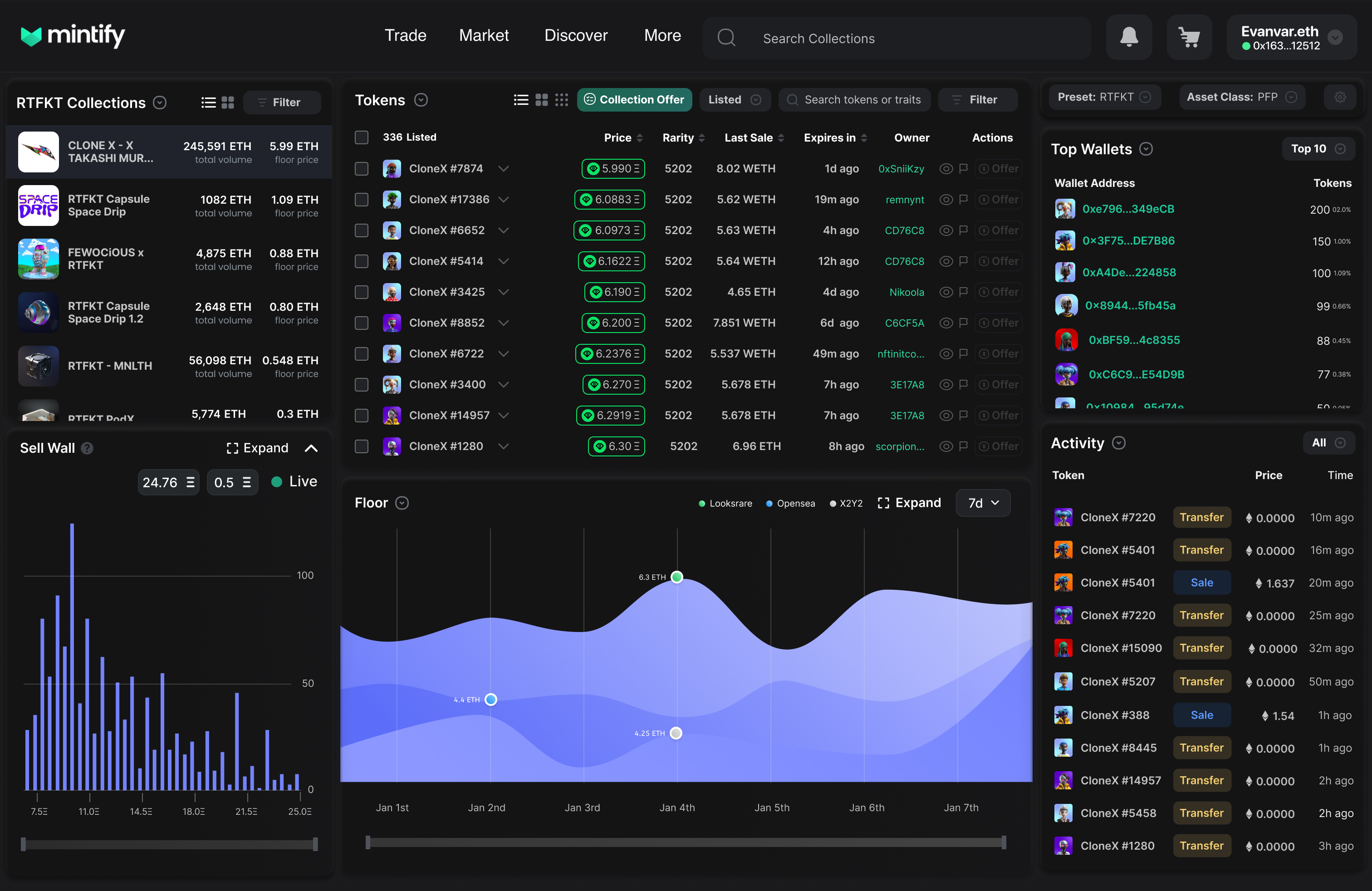
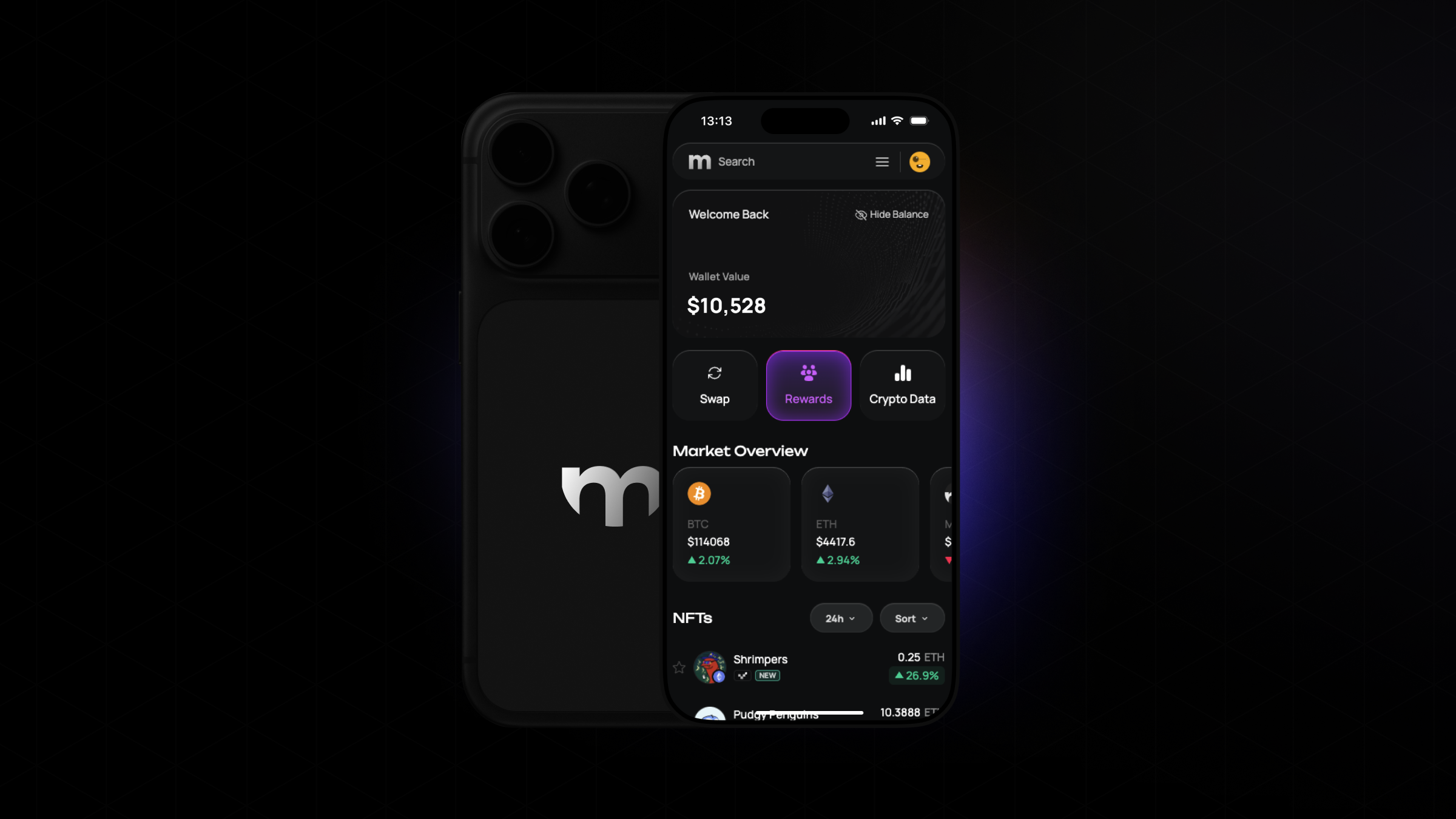
V3: Current Platform & Mobile
The current version represents our most refined thinking — a balance of information density and visual clarity that works across desktop and mobile. The latest mobile app brings the full trading experience to iOS and Android without compromising on functionality.
06. Reflections
Building Mintify taught me that in professional-grade tools, 'simple' doesn't mean 'minimal' — it means efficient. By deeply understanding the trader's mental model through extensive user research and trading floor observations, we built a platform that feels like a natural extension of their decision-making process. The density is intentional. The speed is essential. The clarity is earned.